Swift Health Care WebApp
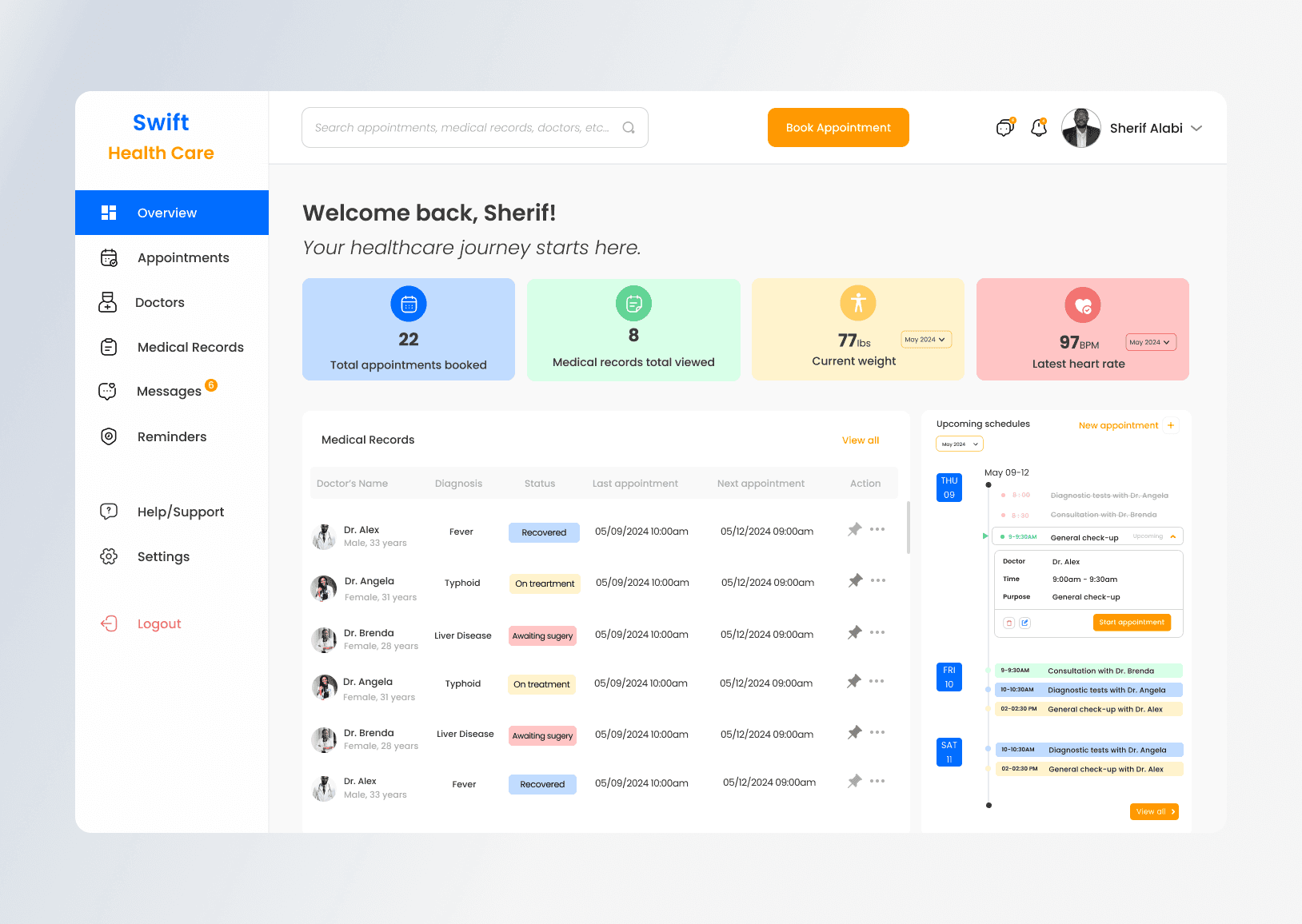
The goal of this project is to design a user-friendly dashboard interface for a healthcare appointment booking system which ensure a seamless experience for patients to schedule appointments, view medical records, communicate with healthcare providers, and receive reminders while ensuring accessibility and privacy considerations.
The goal of this project is to design a user-friendly dashboard interface for a healthcare appointment booking system which ensure a seamless experience for patients to schedule appointments, view medical records, communicate with healthcare providers, and receive reminders while ensuring accessibility and privacy considerations.


My Role
My Role
Product Designer
Industry
Industry
Health Care Sector
Health Care Sector
Time Frame
Time Frame
1 week
1 week
Tools Used
Tools Used
Figma for wireframing, prototyping, and design.
Adobe Illustrator for creating custom icons and graphics.
UserTesting.com for gathering user feedback.
Figma for wireframing, prototyping, and design.
Adobe Illustrator for creating custom icons and graphics.
UserTesting.com for gathering user feedback.
Figma | Notion | Google Forms |
Google Docs
Link to Figma File
Link to Figma File
Figma | Notion | Google Forms |
Google Docs
Preview prototype video
Preview prototype video
Figma | Notion | Google Forms |
Google Docs
Explore Prototype
Explore Prototype
Figma | Notion | Google Forms |
Google Docs
The Challenge
Objective: To design a user-friendly dashboard interface for a healthcare appointment booking system, allowing patients to:
Schedule appointments with healthcare providers
View medical records, including past appointments, lab results, and prescriptions
Communicate with healthcare providers
Receive reminders for upcoming appointments
Ensure accessibility and privacy considerations
Key Features to Demonstrate:
Dashboard Overview:
Displays a summary of upcoming appointments, message notifications, and important reminders.
Includes key metrics such as appointment history, medical records access, and health goals progress.
Appointment Scheduling:
Allows patients to easily schedule appointments by selecting dates, times, and healthcare providers.
Provides options to reschedule or cancel appointments with ease.
Medical Records Access:
Enables patients to view their medical records, including past appointments, lab results, and prescriptions.
Allows patients to download their medical records for personal reference.
Communication Features:
Provides a messaging system for patients to communicate with healthcare providers.
Displays message history and allows for easy sending and receiving of messages.
Accessibility Considerations:
Ensures high contrast and readable fonts for users with visual impairments.
Provides options for adjusting text size and using screen readers.
Privacy and Security:
Ensures all patient data is securely stored and complies with privacy regulations.
Implements secure authentication and data encryption to protect patient information.
The Goal
The primary goal of this project was to design an intuitive and accessible dashboard interface for a healthcare appointment booking system. The design needed to:
Simplify the Appointment Scheduling Process: Enable patients to easily schedule, reschedule, or cancel appointments by selecting dates, times, and healthcare providers.
Enhance Access to Medical Records: Provide patients with easy access to their medical records, including past appointments, lab results, and prescriptions, and allow them to download their records for personal use.
Facilitate Communication: Offer a messaging system for patients to interact with healthcare providers, ensuring effective communication and timely responses.
Ensure Accessibility: Design the interface to be accessible for users with varying technical abilities and disabilities, incorporating features such as high contrast, readable fonts, adjustable text size, and screen reader compatibility.
Prioritize Privacy and Security: Ensure that all patient data is securely stored and complies with privacy regulations, incorporating secure authentication and data encryption to protect patient information.
Provide a Seamless User Experience: Implement feedback mechanisms and error handling to ensure a smooth and frustration-free user experience.
Design Process
Design Process:
Understanding the Problem:
Conducted user research to identify pain points and needs of patients when booking healthcare appointments.
Research and Inspiration:
Explore existing healthcare appointment systems like Zocdoc, MyChart, and Practo for insights into effective design patterns.
Studied industry trends and best practices in healthcare UX/UI design.
Sketching and Wireframing:
Created initial sketches to explore different layout options and functionalities.
Developed wireframes to define the basic structure and layout of the system.
Design Iterations:
Created multiple design iterations, focusing on usability, visual appeal, and accessibility.
Gathered feedback from potential users to refine the designs.
Prototyping:
Developed interactive prototypes to test the usability and functionality of the design.
Conducted user testing sessions to gather feedback and identify areas for improvement.
User Testing and Feedback:
Conducted user testing with a diverse group of participants to ensure the design was intuitive for users of varying technical abilities.
Incorporated user feedback to enhance the overall user experience.
Final Design:
Finalized the design, ensuring consistency in visual elements, typography, and color schemes.
Prepared detailed design specifications and assets for handoff to developers.
Digital Wireframe
This design stage is where i designed digital wireframes as it is acrucial step in the design process, offering numerous benefits such as improved collaboration, early detection of usability issues, focus on functionality, efficient use of resources, clear communication, and preparation for high-fidelity design. They serve as an essential tool for creating a user-friendly, accessible, and well-structured healthcare appointment booking system.
This design stage is where i designed digital wireframes as it is acrucial step in the design process, offering numerous benefits such as improved collaboration, early detection of usability issues, focus on functionality, efficient use of resources, clear communication, and preparation for high-fidelity design. They serve as an essential tool for creating a user-friendly, accessible, and well-structured healthcare appointment booking system.


High Fidelity Wireframe
High-fidelity wireframes are an essential step in the design process, offering numerous benefits such as detailed visualization, enhanced user testing, stakeholder buy-in, precise development handoff, refinement of design details, improved communication, and addressing edge cases and complex scenarios. They ensure that the final product is visually appealing, user-friendly, and aligned with the project’s goals and brand standards.
High-fidelity wireframes are an essential step in the design process, offering numerous benefits such as detailed visualization, enhanced user testing, stakeholder buy-in, precise development handoff, refinement of design details, improved communication, and addressing edge cases and complex scenarios. They ensure that the final product is visually appealing, user-friendly, and aligned with the project’s goals and brand standards.


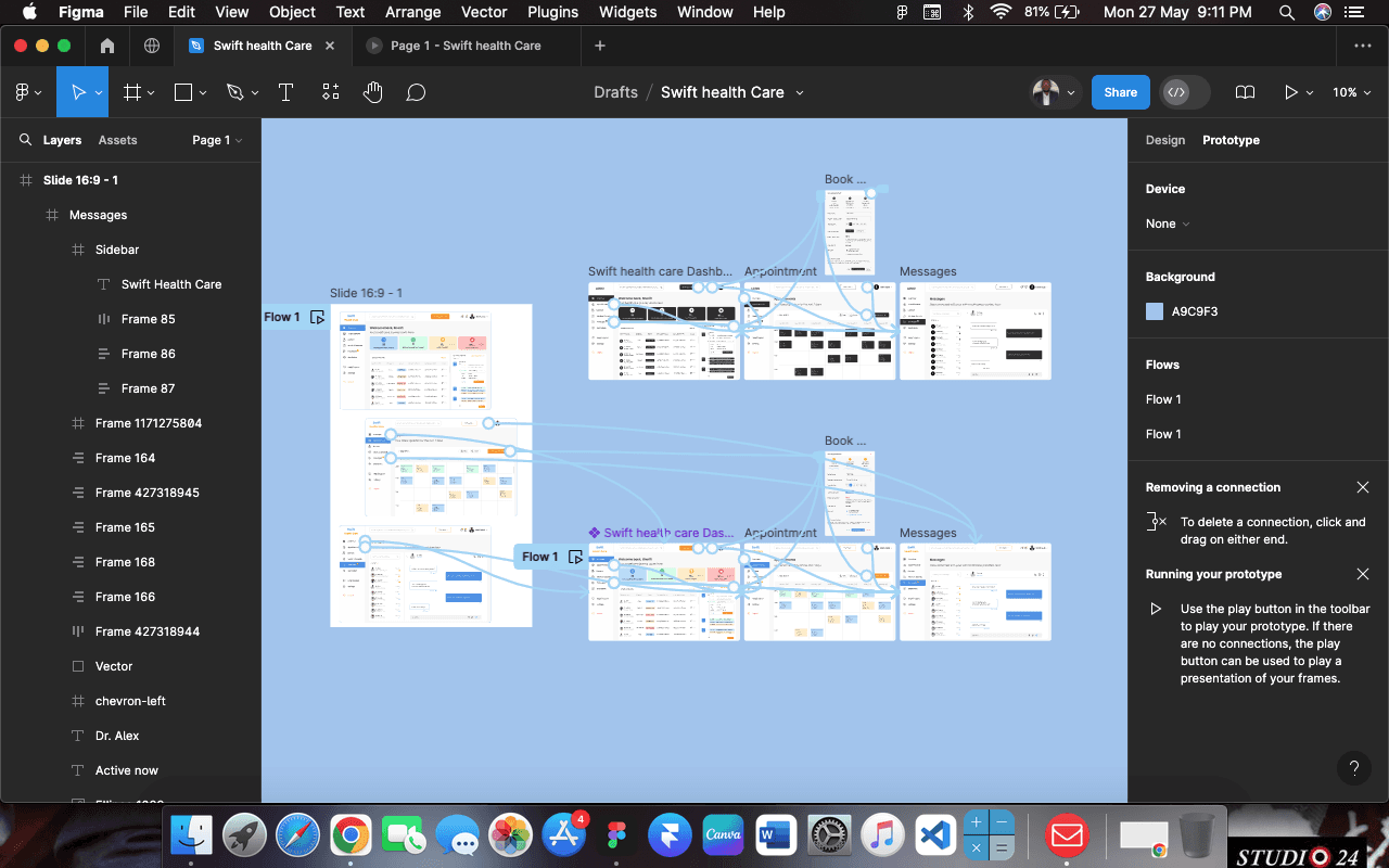
Prototype Flows
Prototype flow is essential for creating a user-centered design that meets the needs and expectations of users. By simulating the real user experience, identifying and resolving issues early, validating design decisions, enhancing stakeholder communication, improving collaboration, demonstrating interactions and animations, testing complex scenarios, and saving time and resources, prototyping ensures a high-quality final product that provides a seamless and intuitive user experience.
Prototype flow is essential for creating a user-centered design that meets the needs and expectations of users. By simulating the real user experience, identifying and resolving issues early, validating design decisions, enhancing stakeholder communication, improving collaboration, demonstrating interactions and animations, testing complex scenarios, and saving time and resources, prototyping ensures a high-quality final product that provides a seamless and intuitive user experience.

Key Outcome
The final design successfully addressed the needs of patients by providing a user-friendly and intuitive interface. The healthcare appointment booking system facilitated seamless scheduling, easy access to medical records, effective communication with healthcare providers, and ensured accessibility and privacy.
Conclusions: This project demonstrated my ability to design a complex system with a focus on usability, accessibility, and user satisfaction. By applying the principle of "Less is more," I was able to create a clean and efficient interface that meets the needs of diverse users in the healthcare domain.
