TravelSafe Travel Planner App
The goal of this project is to design a travel application that provides users with exclusive and adventurous travel experiences. The app aims to be a one-stop solution for adventure enthusiasts, offering a curated selection of activities, accommodations, and destinations.
This UX case study demonstrates how a travel application can be designed to provide users with exclusive and adventurous travel experiences while serving as a one-stop solution for adventure enthusiasts.
UX Designer | UI Designer
Travel & Tourism Sector
Time Frame
6 weeks
The Challenge
Based on my research, traveling is one of the popular activities large number of people chose as their hobbies because it helps to explore new places, foods, learn about people, culture and traditions. Although lots of people often encounter difficulties trying to book trips and making travel plans due to not getting detailed information about the destinations they wish to explore, not being able to manage budget and trip costs especially when traveling with groups as well as having difficulties determining time and distance of different locations while on trips.
The Goal
Design and implement a feature on the application that gives users access to detailed information about different destinations over the world. Propose a suggested travel schedule based on user information, interests, and highlights of the same destination. Design and build a chat features right on the app that allow users interact with other traveler and also gives users access to a community forum where they can learn more about each destination they find themselves. Design and build a budget management tool that helps users to maintain their budget and also provide price range for each location and destination.
Design Process
Research: The first thing i did was understand the project i’m working on to help me realise the user needs, behaviours, goals, industry market and explanatory ux research.
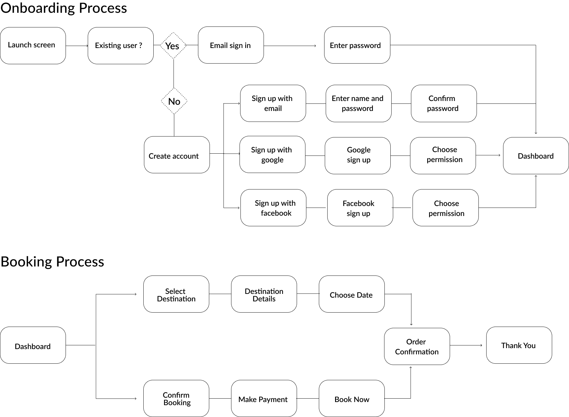
Define: Following my research i proceeded with creating storyboards, user personas, empathy map and user flows that gives users the steps to navigate the app.
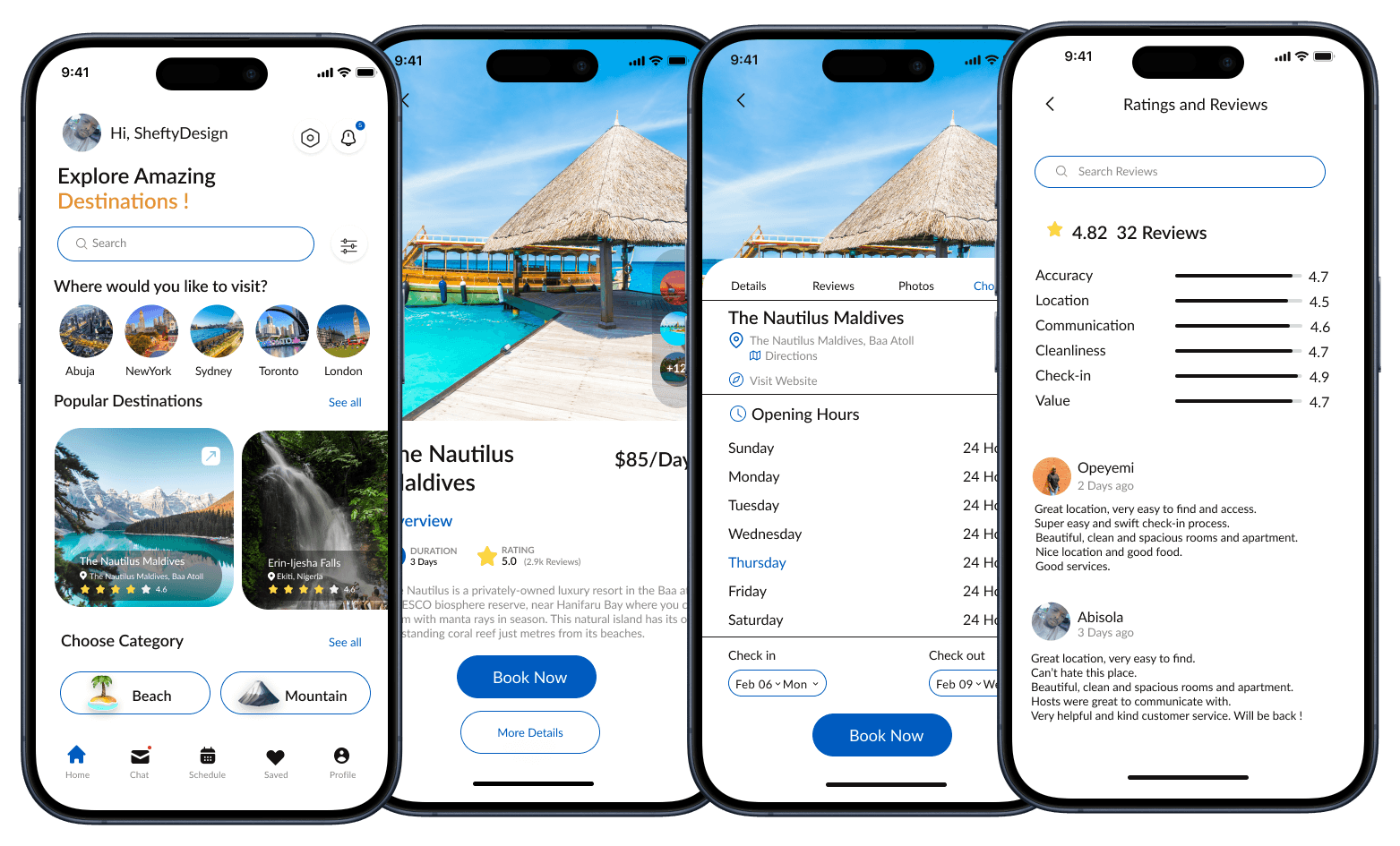
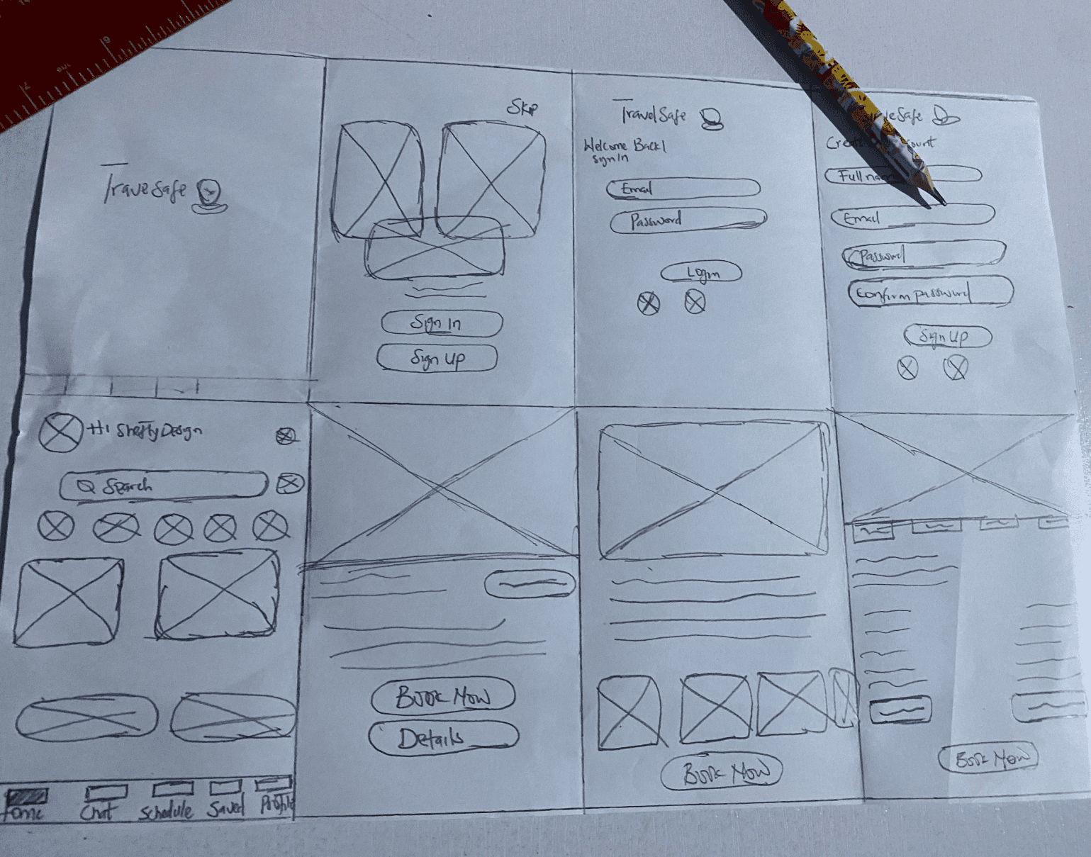
Ideate: After gathering the necessary informations and user guides i then did a paper sketch followed by digital wireframes to give insights of my interface design.
UI Design: This is the stage where i designed the mobile app interface, styles guides and the interaction designs of my project after which it was tested.
Design Validation: To ensure the mobile app is user friendly and accessible, some selected screens and user flows went through repeated rounds of usability testing before it was deploy.
Research Processes
User Research
Who are the target users ? I defined the target user as: young people from 18 to 40 years old, the Millennial generation - who are mostly not bothered about how “hard" things can get but the major concerned is “waiting", my research shows the target user hate having to waste time, they love technology, internet, good travel experience, enjoy to discover new things and also like to share their experiences and enjoy having a have high community cohesion.
Key Research Questions
How often do you make use of travel app to plan your trips?
Would you like to connect with other travellers on solo trips?
What motivated you to visit certain places?
Prior to your travel experiences using apps were you satisfied with the payment methods ?
Where do you look for informations to plan for trips?
User Survey Research
I’m a UX Designer who’s interested in creating a travel app that provide users with an exclusive and adventurous travel experiences. This app also intends to acts as a one stop solution for adventure enthusiasts.
Research Insights
85% Participants prefer to plan a trip ahead but don’t know where to visit and also needs more information about the locations before embarking on trips.
90% Participants wants an app that gives suggestions of places to visit based on their activities and interactions while using the app.
50% Participants aren’t satisfied with available payment methods and need more secured and trusted payment methods.
80% Participants would like to have a chat features right on the app that allow them interact with other traveler and also gives users access to a community forum where they learn and know more about their destination.
Empathy Map
I created an empathy map following the combined insights and informations gathered from multiple participants and users during my interviews to help me gain a better knowledge of users frustrations, what they think, how they feel and thier experiences.
Think:
Users wish to be guided and give detailed informations about a particular destination before embarking on trips.
Users wants recommendations on place to visit.
Would like to book reservations easily and transparent.
Proper and affordable transportation planning is important.
Feels:
Worried about safety and fake reviews.
Disappointed about fees not being transparent.
Lonely and insecure.
Says :
I hope and would like to get suggestions on new places to explore and visit not same old location over and over again.
Travelling in group would be fun and exciting.
Want to get detailed informations and guide about particular trip in order to feel safe.
Need to get familiar with other travellers before meeting in person.
Does :
I usually check online for places to visit and explore.
Use the internet to gather relevant informations and reviews.
Reach out to friends and family for suggestions on place to visit.
Information Architecture
Here is the user flow diagram i created which outlines the basic step users will follow to complete task based on user’s preferences. User flows explains how users navigate paths required to complete a specific task.
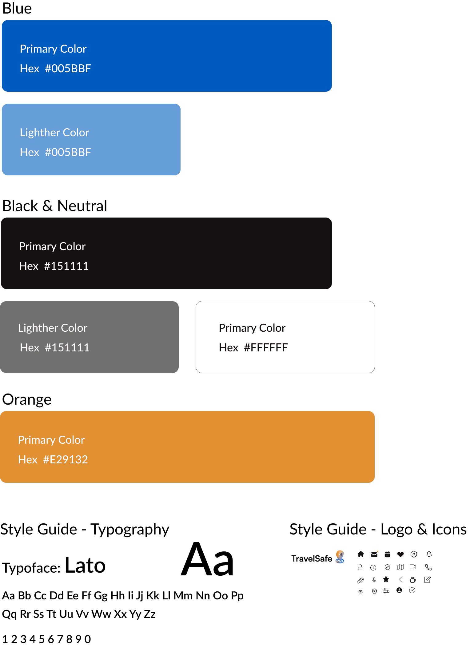
Design System
Style guides provide guidelines for how design elements such as colors, typography, imagery, and layout should be used to ensure consistency and coherence across all brand communications.
Sketches
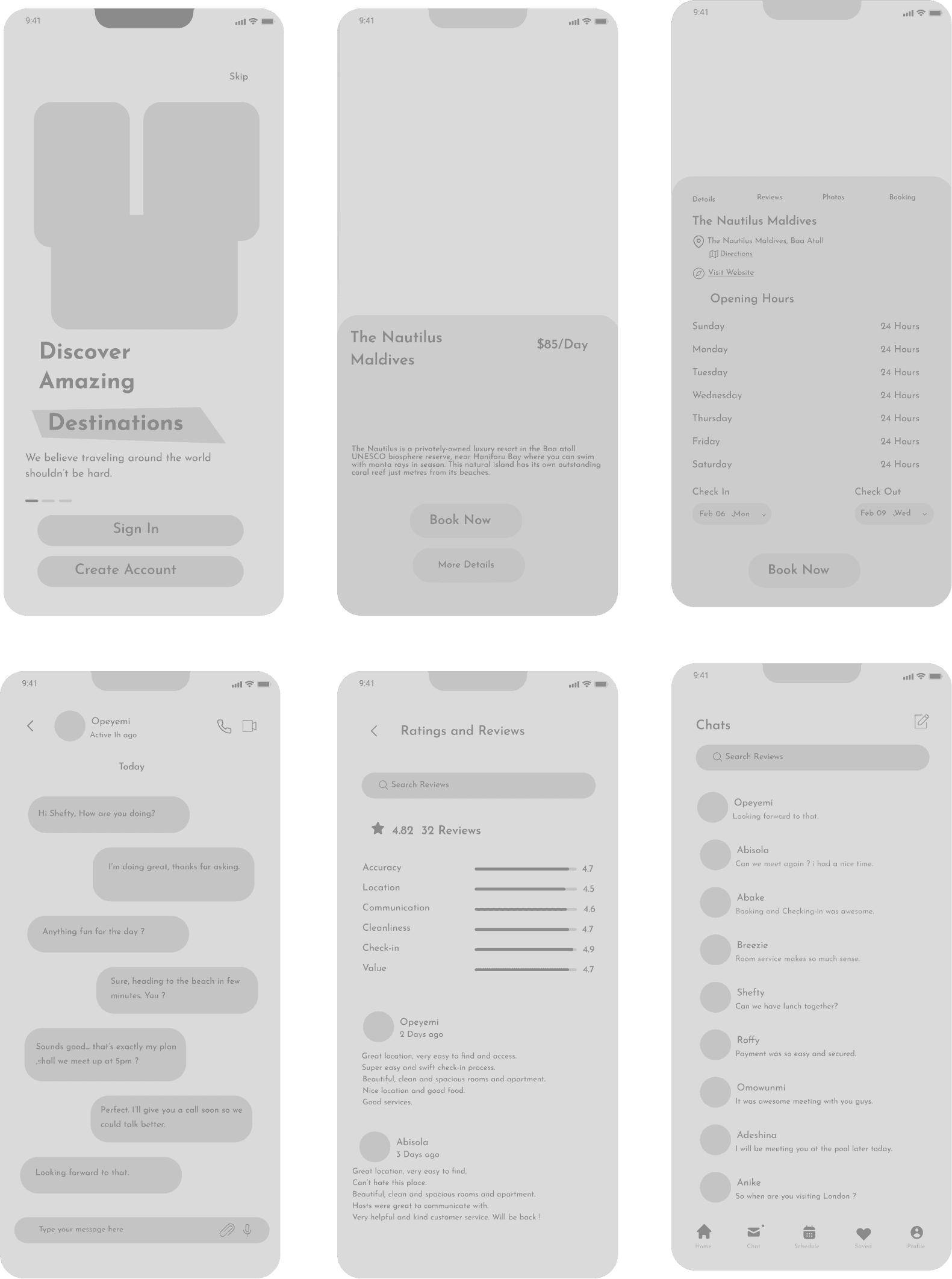
I find that sketching my wireframe is my preferred method for ideating my designs before transitioning to mid-fidelity wireframes.
Mid-Fidelity Wireframe
Mid-Fidelity wireframes strike a balance between low and high-fidelity wireframes, offering enough detail to convey design concepts effectively while remaining flexible and easy to iterate on.
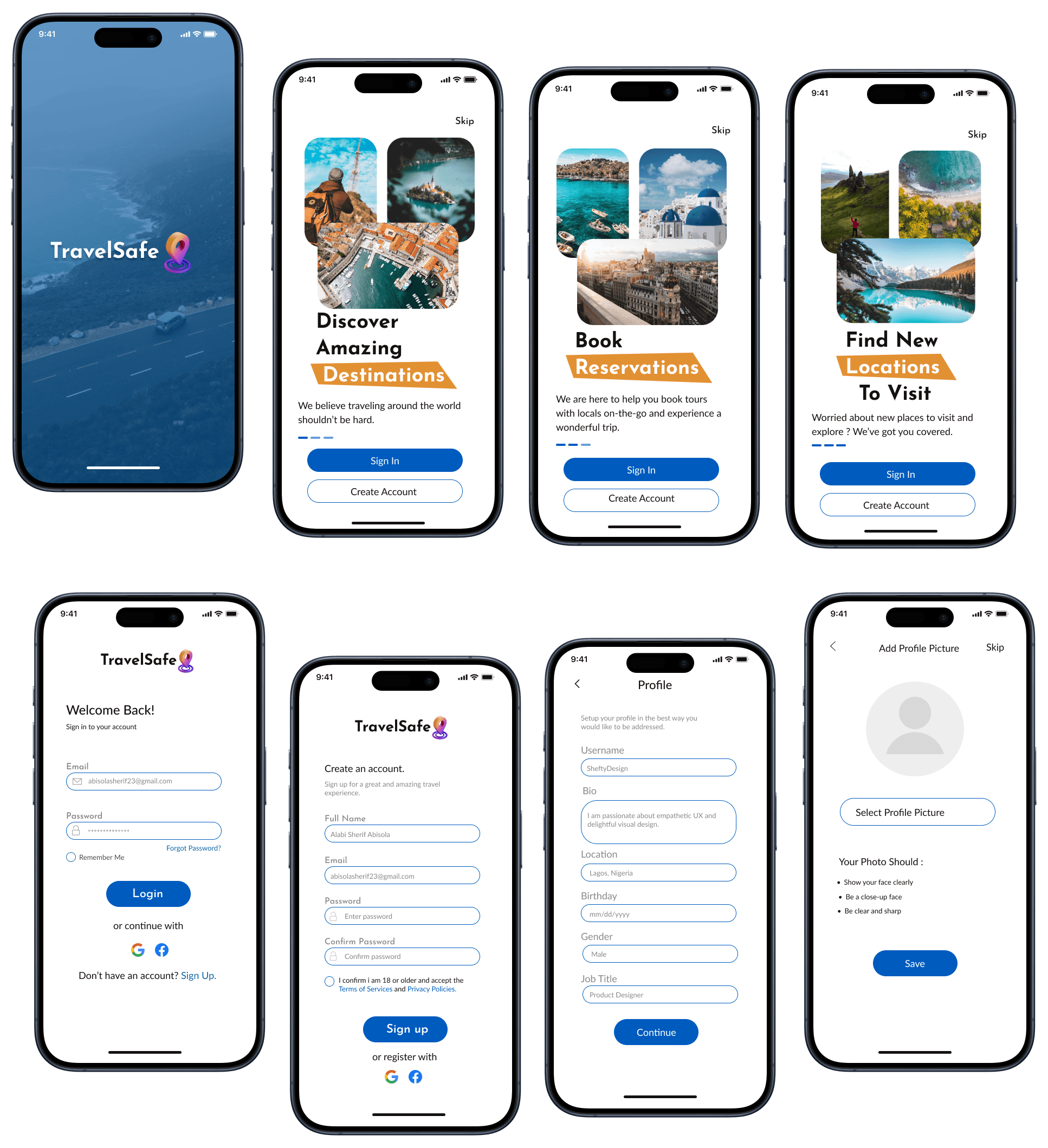
Onboarding & Registration
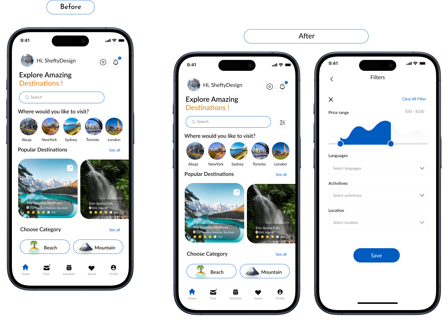
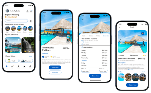
Dashboard & Booking
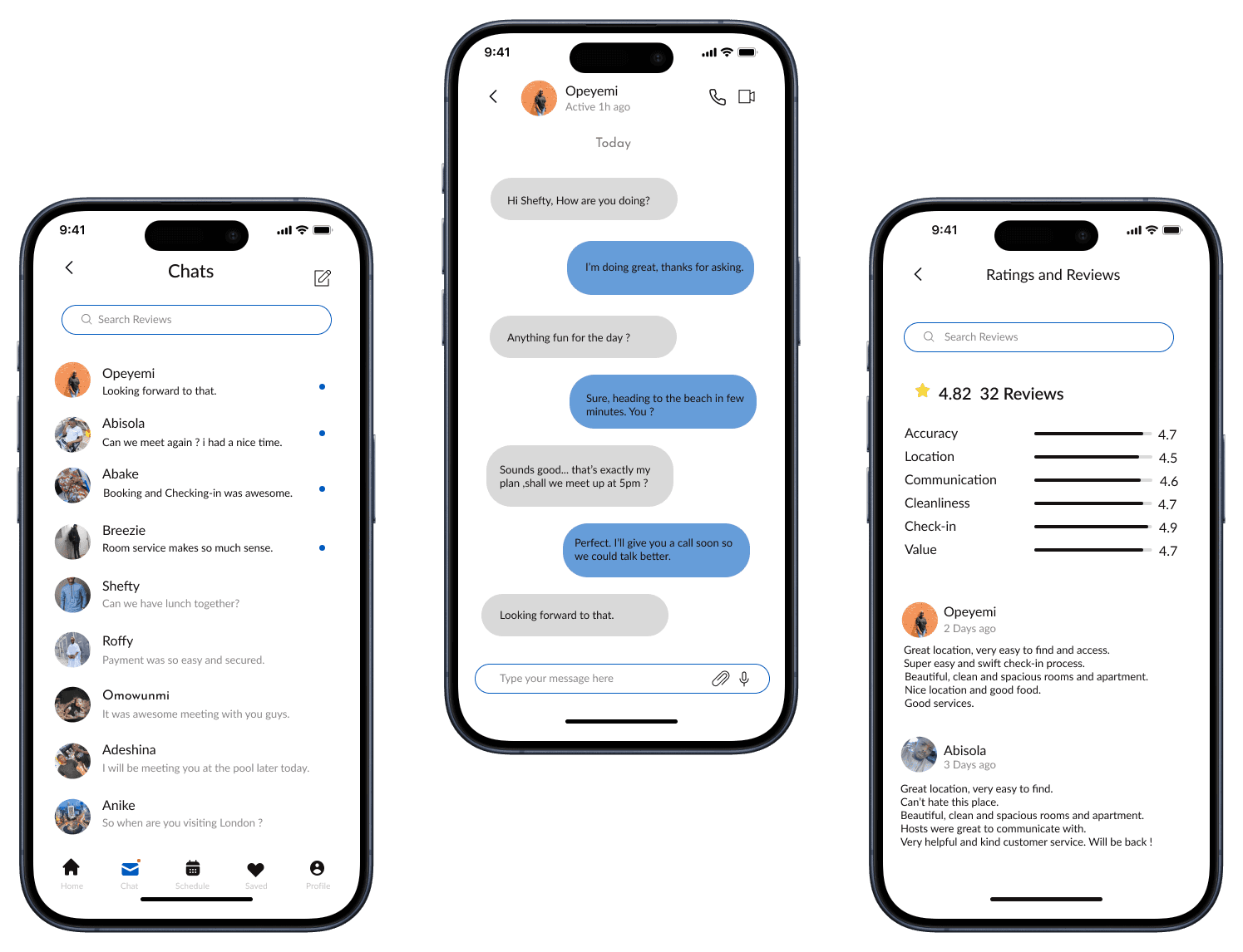
Chat & Review screen
Usability Testing Process
Some selected screens of my mobile app project went through round of testing to determine if the app is usable and is well accessible to the users. Below is the results from the complaints and suggestions made by users.
I shared the prototype screens i designed on figma with 3 users via Google chat and got some feedbacks about the app and usability, after the session i wrote down the feedbacks then noticed more suggestions and complains are about the dashboard to have a filter button to enable a better navigations for users which i did make the changes.
Key Learnings
Working on this project was stimulating because I was constantly thinking about how to combine simplicity with trustworthiness. At times I found myself treading the lines and making sure that its simplicity would not have a negative effect on user experience. My research on the topic inspired me to learn more about simplicity in UX design. I enjoyed working on this project especially since it was all about making things easier for other’s. My greatest takeaway was the importance of conducting user testing which made me understand what user’s thinks and what function that will give them a good and better experiences.

