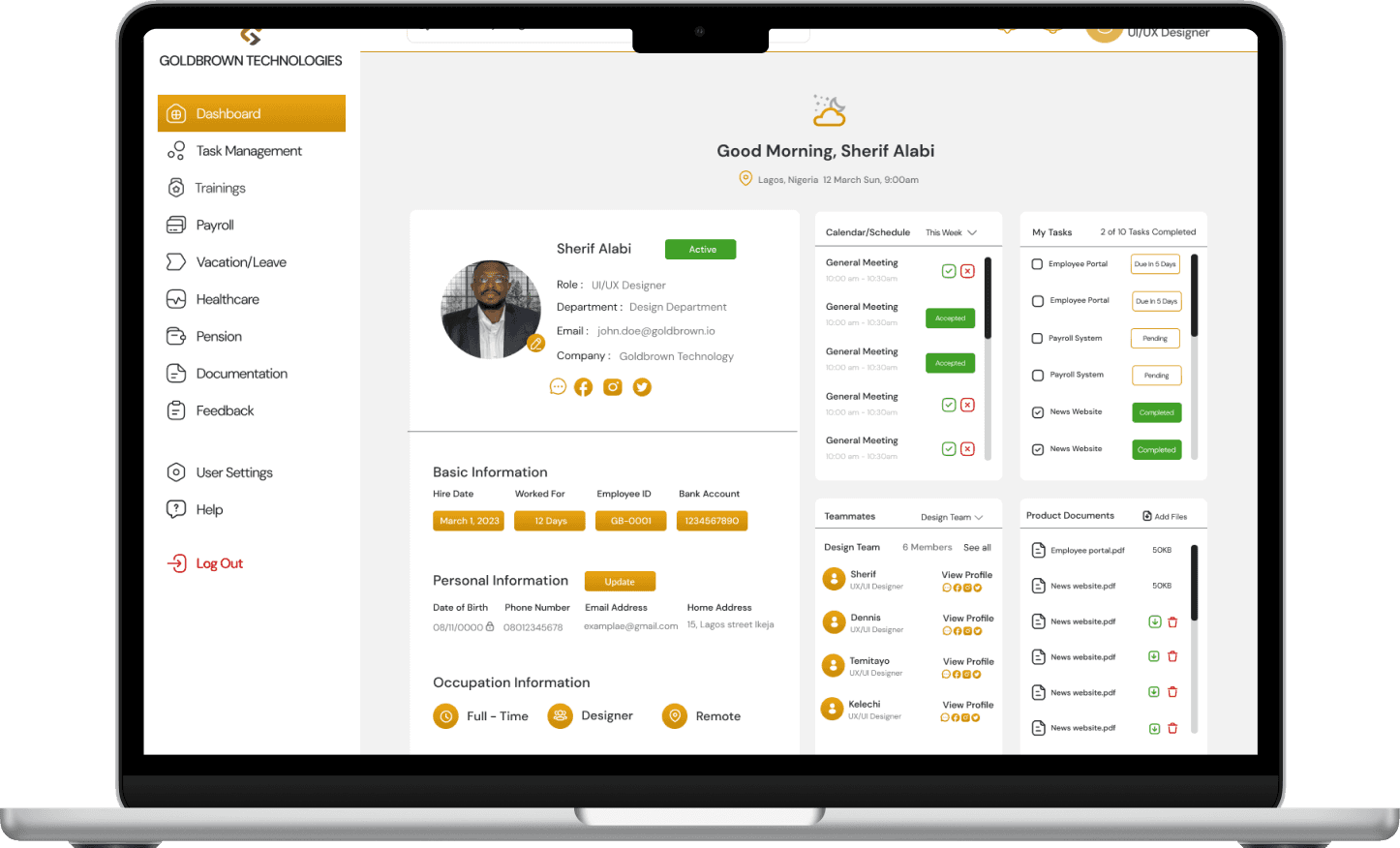
Employee Portal
The goal of this employee portal UX case study is to demonstrate the process of designing employee portal for a medium-sized tech company, with a focus on improving user experience (UX) and increasing employee engagement and productivity.
Confidentiality Disclaimer: Due to signed DNA (Non-Disclosure Agreement), much cannot be shared on this, however the purpose of this case study is to provide a general overview of the process and methods used in designing the employee portal for a medium-sized tech company named GoldBrown Technologies. Specific details, data, and insights that are subject to confidentiality agreements have been excluded from this presentation.
Thank you for your understanding.
Product Designer
Human Resources
Time Frame
4 weeks
The Challenge
Complexity: Employee portals can become complex due to the variety of features and information they offer, making it challenging for users to navigate and find what they need.
User Adoption: Getting employees to use the portal regularly can be a challenge, especially if they are used to traditional methods of accessing information or if the portal is not user-friendly.
Content Management: Keeping the content on the portal up-to-date and relevant can be challenging, especially in organizations with frequent changes in policies, procedures, or personnel.
Security: Ensuring the security of sensitive information stored on the portal, such as employee personal data or company confidential information, is a significant challenge.
Integration: Integrating the portal with other systems and tools used by the organization, such as HR systems, communication tools, or document management systems, can be complex and time-consuming.
Mobile Accessibility: Providing a seamless and user-friendly experience on mobile devices can be challenging, especially considering the variety of devices and screen sizes.
User Feedback: Gathering and incorporating user feedback to continuously improve the portal can be challenging, especially if there is resistance from users or limited resources for collecting feedback.
The Goal
The goal of this employee portal UX case study is to demonstrate the process of designing employee portal for a medium-sized tech company, with a focus on improving user experience (UX) and increasing employee engagement and productivity.
The Team
Product Designer
Product Owner
Project Manager
Frontend Developer
Backend Developer
Processes
The Scope
Conducted user research to understand the needs and pain points faced by employees.
I then design wireframes and prototypes for the employee portal.
Tested the prototypes with users and gather feedback for iteration.
Implemented the final design based on user feedback.
Research Phase
Conducted interviews with employees from different departments to understand their needs and pain points.
Created user personas based on the interview findings to guide the design process.
Analyzed existing employee portal analytics data to identify common user paths and areas for improvement.
Design Phase
Created wireframes for the employee portal, focusing on improving navigation and adding key features such as a personalized dashboard and a knowledge base.
Designed high-fidelity prototypes using the company's branding guidelines.
Conducted usability testing with employees to gather feedback on the prototypes.
Implementation Phase
Based on user feedback, i refined the design of the employee portal to improve usability and clarity.
Worked closely with the development team to implement final design.
Conducted a final round of user testing to ensure the new portal met the needs of employees.
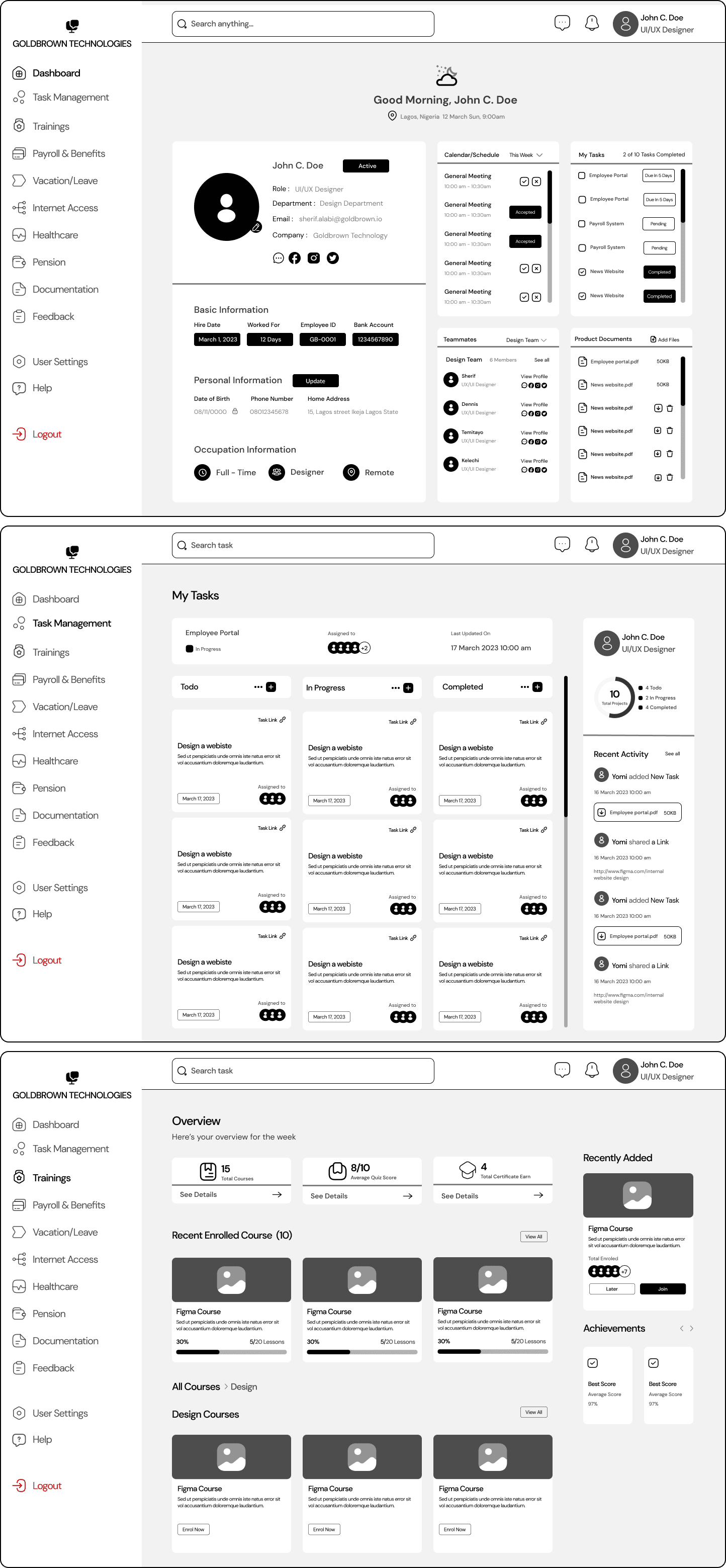
Low Fidelity Wireframe
This design stage is where i designed wireframes as it is a critical step in the design process that provides valuable insights into the layout, structure, functionality, and content of a employee portal, helping to ensure its success. This stage of testing provides specific insights tailored to the needs of the workforce. Here are some key insights gained:
User Flow: Visualization on the user flow, showing how employees will navigate through different sections and access various features.
Content Organization: Wireframes has helped show how to organize content within the portal to make it easily accessible for employees.
Feature Prioritization: Wireframes priotize the need to show the employees the features based on their importance. Such as tasks management, employee calendar & schedule, team-mates and shared project documents for easy accessibility.
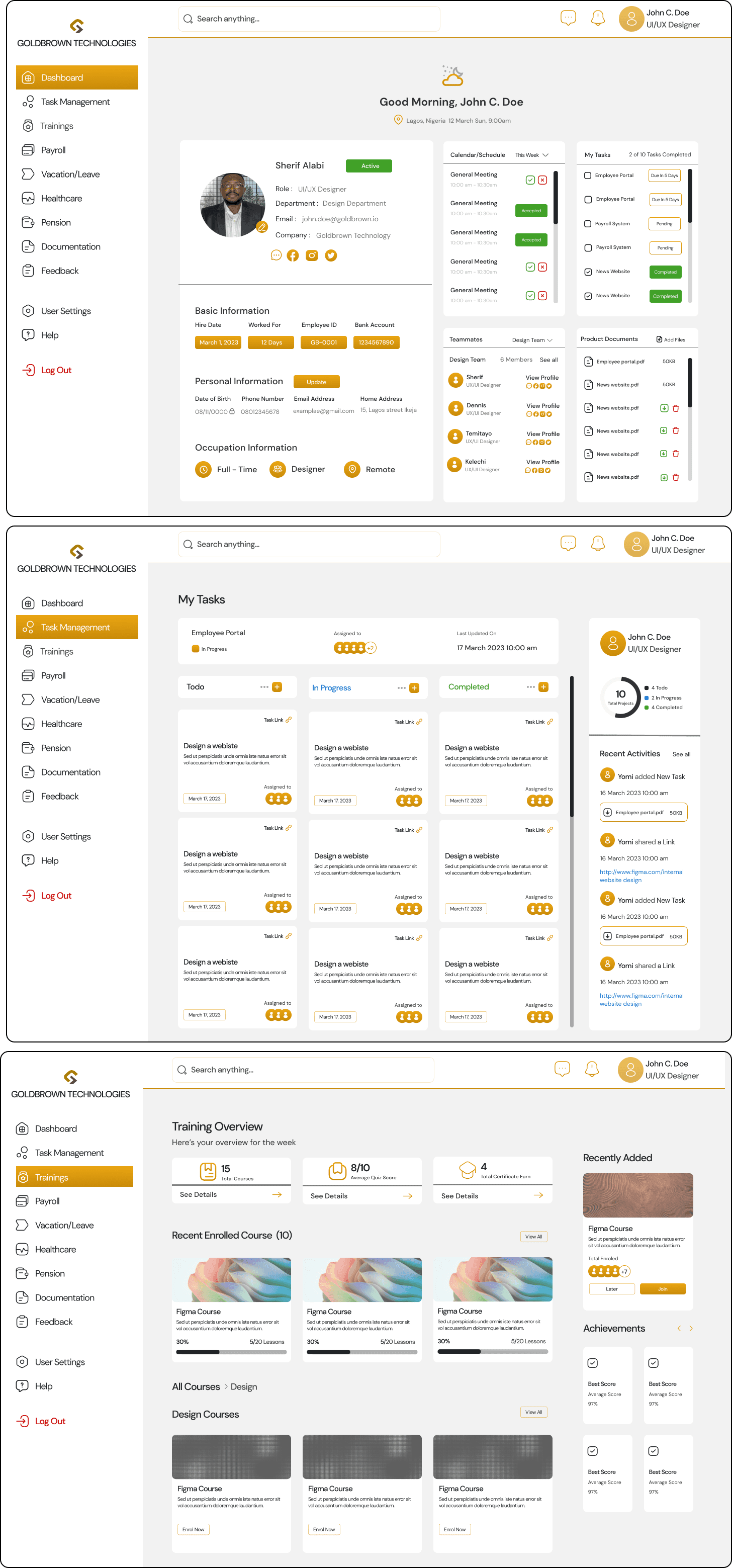
High Fidelity Wireframe
High fidelity iteration stage of the employee portal involves adding visual design elements and finer details to the wireframes by implementing the use of consistent colors following the company design system guidelines. Here are some key considerations while creating the high-fidelity design:
Visual Design: Incorporated the company's branding guidelines, which includes colors, fonts, and logo, to ensure the portal aligns with the company's overall visual identity.
Typography: Used readable fonts for body text and headers, ensuring that the text is clear and easy to read.
Layout and Navigation: Refined the layout based on user feedback from the wireframing stage, ensuring that navigation is intuitive and that key features are easy to access.
Accessibility: Ensure that the design complies with accessibility standards, making it usable for current employees, and future employee.
Testing: Conducted usability testing with employees to gather feedback on the high-fidelity design and then made every necessary refinements before final presentation to the development team.
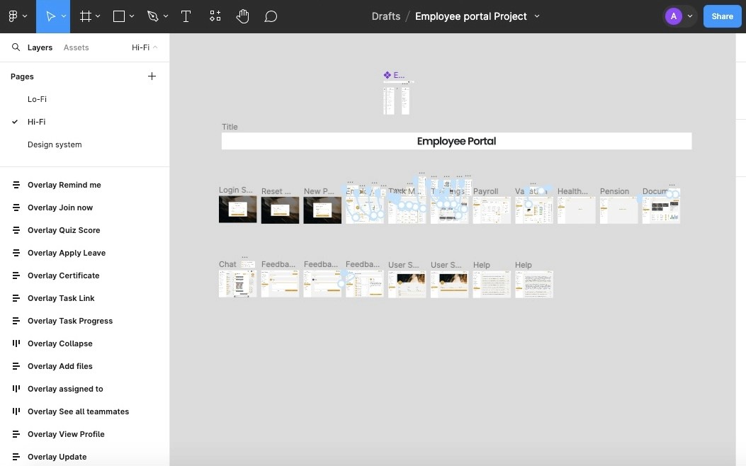
Prototype Flows
At the end of the final design, prototype was created to showcases its features, functionality, and interactions within the portal, helping to ensure that the final product meets the needs of employees and provides a positive user experience.


